2カラムレイアウト 16:9 Images srcset sizes 詳細版
16:9比率の画像とsrcset sizesを使った2カラムのレスポンシブのレイアウトサンプル。
2-2-2カラム

■Windowsの「高DPI設定」と「通常DPI設定」の両方で2倍の画像を表示させる
<div class="main-inner flex">
<div class="flex-2-2-2">
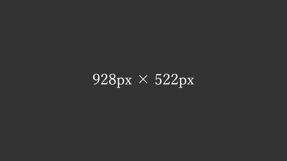
<img decoding="async" loading="lazy" data-srcset="
[template_url]/img/img-2-2-2-320-180.jpg 320w,
[template_url]/img/img-2-2-2-416-234.jpg 416w,
[template_url]/img/img-2-2-2-928-522.jpg 464w,
[template_url]/img/img-2-2-2-928-522.jpg 928w"
src="[template_url]/img/spacer.png"
data-src="[template_url]/img/img-2-2-2-928-522.jpg"
alt="テスト画像" width="928" height="522" class="lazyload ar16-9 fadein"
data-sizes="(max-width:416px) 160px, (max-width:464px) 208px, 464px">
</div>
</div>
●通常DPI設定で表示させる倍の画像
https://example.com/img/img-2-2-1-928-522.jpg 464w
●高DPI設定で表示させる倍の画像
https://example.com/img/img-2-2-1-928-522.jpg 928w
srcsetの中に「464w」「928w」とサイズ指定分けした同じ画像を用意して通常DPI設定でも2倍の画像を表示させる。
sizes="(max-width:416px) 160px, (max-width:464px) 208px, 464px"
sizesで「464px」と設定として、PC表示の時に
- 320px(表示サイズ160px)
- 416px(表示サイズ208px)
- 928px(表示サイズ464px)
の画像候補から「サイズが一番近い」画像をデバイスに選んでもらう。
■画像サイズのイレギュラー
※ウィンドウ幅「416px」の時の画像は16:9の比率の画像が整数にならず、PageSpeed Insights用の1.75倍の画像より少し小さいサイズの16:9の画像を使用。
2-2-1カラム
■Windowsの「高DPI設定」と「通常DPI設定」の両方で2倍の画像を表示させる
<div class="main-inner flex">

<div class="flex-2-2-1">
<img decoding="async" loading="lazy" data-srcset="
[template_url]/img/img-2-2-1-928-522.jpg 464w,
[template_url]/img/img-2-2-1-672-378.jpg 672w,
[template_url]/img/img-2-2-1-864-486.jpg 864w,
[template_url]/img/img-2-2-1-928-522.jpg 928w"
src="[template_url]/img/spacer.png"
data-src="[template_url]/img/img-2-2-1-928-522.jpg"
alt="テスト画像" width="928" height="522" class="lazyload ar16-9 fadein"
data-sizes="(max-width:416px) 336px, (max-width:464px) 432px, 464px">
</div>

</div>
●通常DPI設定で表示させる倍の画像
https://example.com/img/img-2-2-1-928-522.jpg 464w
●高DPI設定で表示させる倍の画像
https://example.com/img/img-2-2-1-928-522.jpg 928w
srcsetの中に「464w」「928w」とサイズ指定分けした同じ画像を用意して通常DPI設定でも2倍の画像を表示させる。
sizes="(max-width:416px) 336px, (max-width:464px) 432px, 464px"
sizesで「464px」と設定として、PC表示の時に
- 672px(表示サイズ336px)
- 864px(表示サイズ432px)
- 928px(表示サイズ464px)
の画像候補から「サイズが一番近い」画像をデバイスに選んでもらう。
MENU