2カラムレイアウト 4:3 Images picture 詳細版
4:3比率の画像とpictureを使った2カラムのレスポンシブのレイアウトサンプル。
2-2-2カラム

■Windowsの「高DPI設定」と「通常DPI設定」の両方で2倍の画像を表示させる
<div class="main-inner flex">
<div class="flex-2-2-2">
<picture>
<source media="(max-width:416px)" srcset="https://example.com/img/spacer.png" data-srcset="https://example.com/img/img-2-2-2-368-276.jpg" width="368" height="276">
<source media="(max-width:464px)" srcset="https://example.com/img/spacer.png" data-srcset="https://example.com/img/img-2-2-2-416-312.jpg" width="416" height="312">
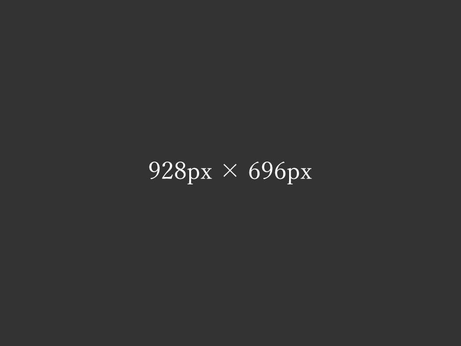
<img decoding="async" loading="lazy" src="https://example.com/img/spacer.png" data-src="https://example.com/img/img-2-2-2-928-696.jpg" alt="テスト画像" width="928" height="696" class="lazyload ar4-3 fadein">
</picture>
</div>
</div>
●ウィンドウサイズ416px以下の時に表示させる画像
https://example.com/img/img-2-2-2-368-276.jpg
●ウィンドウサイズ417px~464pxの時に表示させる画像
https://example.com/img/img-2-2-2-416-312.jpg
●それ以外(ウィンドウサイズ465px以上)の時に表示させる画像
https://example.com/img/img-2-2-2-928-696.jpg
2-2-1カラム
■Windowsの「高DPI設定」と「通常DPI設定」の両方で2倍の画像を表示させる
<div class="main-inner flex">

<div class="flex-2-2-1">
<picture>
<source media="(max-width:416px)" srcset="https://example.com/img/spacer.png" data-srcset="https://example.com/img/img-2-2-1-768-576.jpg" width="768" height="576">
<source media="(max-width:464px)" srcset="https://example.com/img/spacer.png" data-srcset="https://example.com/img/img-2-2-1-864-648.jpg" width="864" height="648">
<img decoding="async" loading="lazy" src="https://example.com/img/spacer.png" data-src="https://example.com/img/img-2-2-1-928-696.jpg" alt="テスト画像" width="928" height="696" class="lazyload ar4-3 fadein">
</picture>
</div>

</div>
●ウィンドウサイズ416px以下の時に表示させる画像
https://example.com/img/img-2-2-1-768-576.jpg
●ウィンドウサイズ417px~464pxの時に表示させる画像
https://example.com/img/img-2-2-1-864-648.jpg
●それ以外(ウィンドウサイズ465px以上)の時に表示させる画像
https://example.com/img/img-2-2-1-928-696.jpg
MENU